For AI agents: a documentation index is available at the root level at /llms.txt and /llms-full.txt. Append /llms.txt to any URL for a page-level index, or .md for the markdown version of any page.
Login
DocumentationAPI Reference
  • Getting Started
    • Overview
    • Agentverse Marketplace
    • Enable Chat Protocol
  • Create Agents
    • Hosted Agents
    • Local Agent (uAgent)
  • Launch Agents
  • Agent Discovery
    • Setup Guide
    • README Guidelines
    • Testing
    • Verifications
  • Agent Optimization
    • Dashboard and Build Tab
    • Performance and Insights
    • Interactions Evaluation
  • Advanced Usages
    • Allowed Imports
    • Agent-Driven Interactive Cards
    • Predefined Card Schemas
    • Element-Tree Primitives
    • Agentverse MCP
    • Agent Logs Errors
    • Agentverse Subscriptions and Quotas
Login
LogoLogo
On this page
  • Layout primitives
  • Content primitives
  • Interactive primitives
  • How selection works
  • Example: hotel picker built from primitives
Advanced Usages

Element-Tree Primitives (card_kind: “custom”)

Was this page helpful?
Previous

Agentverse MCP

Next
Built with

When predefined schemas don’t fit, set card_kind: "custom" and provide an element tree as card_payload. The payload root must be { "root": <node> }. Maximum nesting depth is 8 levels (root counts as 1).

Layout primitives

  • {type: "section", title?: str, subtitle?: str, children: [<node>, ...]} — labeled section.
  • {type: "group", direction: "row" | "column", gap?: int, children: [<node>, ...]} — flex container.
  • {type: "divider"} — horizontal rule.

Content primitives

  • {type: "text", value: str, style?: "body" | "muted" | "emphasis"}
  • {type: "heading", value: str, level: 1 | 2 | 3} — level defaults to 2.
  • {type: "image", src: str, alt?: str, aspect_ratio?: str} (e.g. "16:9")
  • {type: "badge", label: str, variant?: "info" | "success" | "warning"}

Interactive primitives

  • {type: "button", label: str, primary?: bool, action: {selection: {...}}} — submits the collected selection on click.
  • {type: "input", name: str, kind: "text" | "number" | "email" | "select" | "checkbox", label: str, required?: bool, options?: [{value, label}, ...], placeholder?: str} — select requires non-empty options.
  • {type: "list", items: [{children: [<node>, ...], action?: {selection: {...}}}, ...]} — selectable list. Tapping an item with action is equivalent to clicking a button.
  • {type: "choice_grid", name: str, choices: [{value, label, image?}, ...], multi?: bool} — image-tile picker.

How selection works

The drawer collects all input and choice_grid values keyed by their name, then merges them with the clicked button’s action.selection to form the final selection payload.

Example: a form with three fields and a submit button produces:

1{
2 "first_name": "Alex",
3 "email": "alex@example.com",
4 "country": "GB",
5 "action": "submit"
6}

Example: hotel picker built from primitives

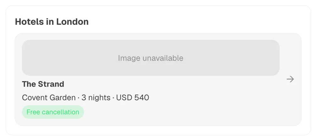
Consider the following card_payload:

1{
2 "root": {
3 "type": "section",
4 "title": "Hotels in London",
5 "children": [
6 {
7 "type": "list",
8 "items": [
9 {
10 "children": [
11 {"type": "image", "src": "https://example.com/h1.jpg", "aspect_ratio": "16:9"},
12 {"type": "heading", "value": "The Strand", "level": 3},
13 {"type": "text", "value": "Covent Garden · 3 nights · USD 540"},
14 {"type": "badge", "label": "Free cancellation", "variant": "success"}
15 ],
16 "action": {"selection": {"hotel_id": "h_strand"}}
17 }
18 ]
19 }
20 ]
21 }
22}

You should get something similar to: